Reference: agentrosehq.com/aib-chapter-2-1
Please let me know if this is more efficient with custom CSS or if I can make alterations to the Default:
1. I'd like to change the comment bubble color, size, & distance from the right so it aligns better with my spacing on the side
2. change the font color of commenter names, and
3. make the square icons circular like in the default if I use custom CSS + minimal option.
Also, is there documentation on the CSS to change elements in general? Thanks
Hi @agentrosehq,
1. I'd like to change the comment bubble color, size, & distance from the right so it aligns better with my spacing on the side
You can change the color on the Dashboard > wpDiscuz > Settings > Styles & Colors admin page, the option called "Comment Bubble Colors".
The position can be changed by using the following CSS code:
@media only screen and (min-width: 1024px) {
   #wpd-bubble-wrapper {
     left: 75px !important;
   }
}
All CSS codes should be added in the "Custom CSS code" textarea, located on the same page.
2. change the font color of commenter names,
Please read this doc: https://wpdiscuz.com/docs/wpdiscuz-7/plugin-settings/user-labels-and-badges/#comment-author-label-colors-by-user-role
Also, is there documentation on the CSS to change elements in general? Thanks
Here is a useful article:
https://kb.oboxthemes.com/articles/how-to-get-css-styles-for-elements/
In case you want to say thank you! 🙂
We'd really appreciate if you leave a good review on the plugin page.
This is the best way to say thank you to this project and the support team.
Thank you, I have another issue - there's a large blank white section right above where the comments start, how do I get rid of that? reference the same page, it happens on all of them.
there's a large blank white section right above where the comments start, how do I get rid of that?
Use this CSS code:
.comments-area {
   padding-top: 0 !important;
}
.separate-containers .inside-article {
   padding-bottom: 0;
}
I also see the issue with wpDiscuz icons. Please navigate to Dashboard > wpDiscuz > Settings > Styles & Colors admin page make sure the "Load Font Awesome CSS Lib" option is enabled.
In case you want to say thank you! 🙂
We'd really appreciate if you leave a good review on the plugin page.
This is the best way to say thank you to this project and the support team.
What icons in particular do you see this issue with (mind screenshotting)? I checked and I have that enabled already.
Also, how do you change the text highlight color when people want to comment inline? As well as how to change the font for the input prompt (AGENT, leave a comment as you read) to Playfair Display?
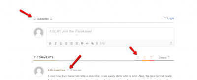
I mean these icons:
In case you want to say thank you! 🙂
We'd really appreciate if you leave a good review on the plugin page.
This is the best way to say thank you to this project and the support team.
@asti Strange, what browser are you using/is it just a problem on your end? I want to make sure this isn't happening for any users on my end because I do have that enabled.
Also, how do you change the text highlight color when people want to comment inline? As well as how to change the font for the input prompt (AGENT, leave a comment as you read) to Playfair Display?
Another problem I have is that I just updated the widget and now there's no inline button to click when I'm editing my page - if you see this page: https://agentrosehq.com/testinline (password testInline)
The inline buttons don't show up. I inserted code before the update - the code I'm using for the first three inline paragraphs for the page is below for reference, please let me know how to make it show.
Thanks
--------
<span style="font-weight: 400">[wpdiscuz-feedback id="7m68nsvk9n" question="AGENT, leave comments as you read!" opened="0"]“The Crown’s agenda has only been expanding due to the increasing number of Boost vendors. She’s more than needed for this operation and will be assisting in our Service.”[/wpdiscuz-feedback]</span>
<span style="font-weight: 400">[wpdiscuz-feedback id="glqzaccnit" question="AGENT, leave comments as you read!" opened="0"]Marianne’s clean, soothing voice was her signature as the head of MI6’s elite unit. Silver hair clipped back in a business twist, she ran her unit’s affairs with executional grace and a refreshingly maternal hand. M eyed her glass monitor. With a swipe of her finger, she shared an agent’s profile with the man in the lab’s central workstation.[/wpdiscuz-feedback]</span>
<span style="font-weight: 400">[wpdiscuz-feedback id="mae2ng1bzy" question="AGENT, leave comments as you read!" opened="0"]On par with the agent’s rumors was the technological signature of HQ’s lab, covertly integrated into Victorian walls and furnishings. Amidst the country’s restless advances in technology, the room reflected the Kingdom’s desire for the nostalgic majesty of a past era. Several glass-thin monitors eclipsed a large central desk, screens rising from their bases on the floor to project the latest surveillance and gear in the works. A tall, lean figure leaned lazily on the desk counter, the faint glow of the screens reflecting in deep-set hazel eyes. [/wpdiscuz-feedback]</span>


