Hello,
I really like the new WPDiscuz7 plugin and I hope you could help me solve a few issues and accept my suggestions:
1. I have Infinite Scroll for posts on my page and unfortunately only the first post have WPDiscuz comments displayed and the rest of posts load the original Wordpress comments
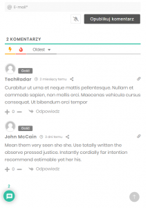
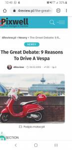
2. On Mobile view (Android, Chrome, Samsung Galaxy S8 Plus) when the plugin is activated, on the post page it's too wide and it adds a few pixels on the right https://4review.pl/?p%3D107&source=gmail&ust=1581903316757000&usg=AFQjCNFnRfgOS6SNNffn8QOZXPUXSdtVE A"> https://4review.pl/?p=107
Hi @kiko91,
Please find my answers below:
1. I have Infinite Scroll for posts on my page and unfortunately only the first post have WPDiscuz comments displayed and the rest of posts load the original Wordpress comments
I'm sorry, but we can't support this feature unless this is the wpDiscuz Lazy Load pagination. wpDiscuz has no chance to support 3rd party AJAX loading functions. This should be done from the infinity loader software you use. If that's the current active theme function you should contact to the theme developers for support.
2. On Mobile view (Android, Chrome, Samsung Galaxy S8 Plus) when the plugin is activated, on the post page it's too wide and it adds a few pixels on the right https://4review.pl/?p%3D107&source=gmail&ust=1581903316757000&usg=AFQjCNFnRfgOS6SNNffn8QOZXPUXSdtVEA/a > A"> https://4review.pl/?p=107
Please leave some screenshot.
3. In mobile view, the Reply button (Odpowiedz) is a little bit higher than the number of likes/dislikes (it's not in the same line)
I don't see such an issue with thumb up and down buttons.
4. The number of comments above the bubble doesn't look good, could you make the number display inside the bubble? I think it would look much better and professional
I'm sorry but this cannot be changed. This is the wpDiscuz Bubble Design. The number in bubble is designed for new comments notifications not for current comments:
5. There should be an option for controlling the displaying the bubble. Like the margin from left and bottom, different for mobile/desktop. For example I have a "back to the top" button on the right and I would like it to be in the same line as the comment bubble.
You should use it on left side if the Back to Top icon is on the right side. Also, you can use custom CSS code:
For desktop:
#wpd-bubble-wrapper {
    margin-left: 0px;
    margin-top: 0px;
    margin-bottom: 0px;
    margin-right: 0px;
}
For mobile (use private session when you check mobile changes to avoid caches):
@media screen and (max-width:480px){
   #wpd-bubble-wrapper {
       margin-left: 0px;
       margin-top: 0px;
       margin-bottom: 0px;
       margin-right: 0px;
   }
}
Hello,
Ad. 2
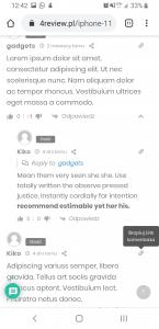
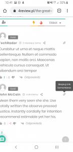
I think I found the reason it's because of the bubble title of copy link to the comment icon and show hide replies icon
https://4review.pl/iphone-11-pro-max-is-now-top-rated-phone-by-consumer/ please check it on mobile
The site is saving more space to display this title on hover.
Is it possible to change the bubble position to fit in the original width?
Could you please check it on our demo page, do you see the same space?
What mobile browser you use?
Hi, I can confirm issue 2 with mobile view.
I use WPDiscuz7 beta6 with iPhoneX and safari browser. I have the bubble disabled but i can still see the extra space.
It's not happening in your demo version, here is working fine> https://wpdiscuz.com/demo/
The bubble doesn't have any relation to this issue. I think this problem comes from your theme. We'll check this and try to adapt the style it for this kind of themes too.
@tomson hi, I'm using chrome on android Samsung galaxy S8 plus. I think in my case it's bubble fault.
In your demo I don't see this problem but I see that in demo you have wider margins than in my website that's why there is more space for the bubble to appear


