Hello and happy new year to everyone. I wish you the best with health as a priority!
For my part, I almost never stop working, but it allowed me to progress well and to test a lot of things and to do this "question-problem packaging" ^^.
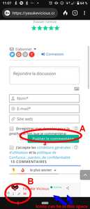
The 1st and 2nd problem is about the lack of space on my phone. the first is for GDPR, and the second is for icons that are too small and too close to the name / avatar. The image below shows the problem better.
I have installed a Plugin to create roles. I created for example the role / badge "Dream Team".
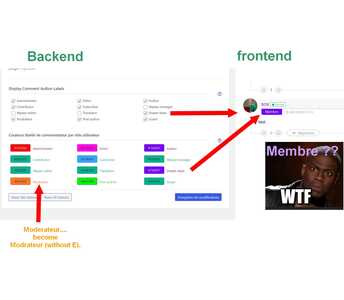
wpDiscuz displays the color of the new Roles / badge, but not the name I chose.
I don't know where the name "member" might come from. See the picture below
I also created a "Moderator" role, but on wpDiscuz the "E" has disappeared ... > "Modrator" ....
Please explain in other words the first issue. The screenshot doesn't explain the issue well.
Regarding the second one, Please navigate to Dashboard > wpDiscuz > Phrases > Comment admin page, find the roles, and change the value of the roles as you like.
In case you want to say thank you! 🙂
We'd really appreciate if you leave a good review on the plugin page.
This is the best way to say thank you to this project and the support team.
The topic is moved to the correct forum.
In case you want to say thank you! 🙂
We'd really appreciate if you leave a good review on the plugin page.
This is the best way to say thank you to this project and the support team.
hi @asti
Thks for the second. 😀 👍
for the first problem..........mmh how to say this in english.....?!
"I would like more space between the words" and Icons (A & B on photos).
The problem with icons (still on the phone) is that you can touch both with your fingers.
I have circled the problem in the photo.
In the case of the A section use the CSS code below:
@media screen and (max-width: 600px){
   #wpdcom .wpd-form-row .wpd-form-col-left, #wpdcom .wpd-form-row .wpd-form-col-right {
      margin-top: 26px !important;
   }
   #wpdcom #wpd-threads {
     margin-top: 34px !important;
   }
}
Also, please try on incognito mode if you're checking on mobile devices. Because mobile browsers have a hard cache, you'll not be able to see the change immediately.
Please see how the B section looks on our devices.
In case you want to say thank you! 🙂
We'd really appreciate if you leave a good review on the plugin page.
This is the best way to say thank you to this project and the support team.
it works ! 😍 😎
my first good news of the day. Thank you @asti
I can't take any more of the technical issues. When I think I solved the problem ... it starts all over again. it's a shame that other developers are not as professional as you .... because some (UserPro) have never answered my emails .... we wonder what their "support" is for !!? !?! 😑
If one day you make a user / mail manager that hides the wordpress interphase and that combines well with emailing services like Mailpoet .... I'll be your first customer !!!!!!! 🤩
in short, sorry, Concern, the B section may be because of my phone (Sony Xperia10 in 21/9 format). If this is not a concern for my users then we will leave it that way for now. Once again thank you....@asti


