First of all, thanks for this plugin! It has a lot of cool functionality!
Alas, I find the subscription process to be extremely confusing.
Confusing #1. If users want to get an email for all comments on the post, they have to first click 'Subscribe' and then click the dropdown box to see their options. That's 2 steps that could be avoided.
Confusing #2. Then, let's say they select the 'Notify of new follow-up comments' option. They have to enter their email in this extra email field, and all of this happens separately from the regular comment posting process, which is confusing.
Confusing #3. If they want to get replies to only their comment, there's also the option to click the bell, but that functionality isn't clear unless they hover over the image.
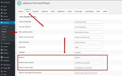
Confusing #4. Even the terminology 'Notify' isn't clear. Why not use the word 'Email'?
My suggestion is to simplify all of this. You could have 2 radio inputs right beside the submit button, 'Email me all new comments on this post' and 'Email me only replies to my comment'. That would eliminate all of the above confusion.
Thanks for reading!
Hi @philraymond,
Radio buttons can only be used with labels, which are long texts, and they are just ugly, they also bloat comment forms. Believe me there is no so critical issue here. People all understand well and use wpDiscuz subscription options without any issue.
1. The Subscription button says all. If a user wants to subscribe, he/she search for "Subscribe" button. So he/she will find all subscription options very easy, it's right at the to of the comment form. And you can use a simple CSS code to keep the subscription bar open.
2. If user is logged in, he/she doesn't have to insert email. And yes, the "Subscribe to All Post Comments" and the "Subscribe to all replies" options should be separated from comment forms. This makes it easy and doesn't require users to leave some comment for the subscription. And this is more user-friendly than forcing users to comment if they want to subscribe to the post comments.
3. That's button is next to the [Post Comment] button, so they are very close and it's not too hard hove and click it. And the Bell is very common icon, so almost all users who is able to comment understand what is Bell.
4. Almost all wpDiscuz frontend phrases are available for changing in Dashboard > wpDiscuz > Phrases admin page, so you can change it to "Email":
Thanks for the thorough answers, Tom.
People all understand well and use wpDiscuz subscription options without any issue.
Are you sure about this? Do you have data? My users are mostly older people who are not tech-savvy. If I find the process confusing, I expect they do, too.
If user is logged in, he/she doesn't have to insert email.
What percentage of blogs ask users to log in before making a comment? I suspect it's very few.
the Bell is very common icon, so almost all users who is able to comment understand
I've never noticed it before but perhaps that's just me.
Almost all wpDiscuz frontend phrases are available for changing
Will do.
Thanks again for your answers. I wish the subscription process was much simpler but I'll try to work with this.
Completely agree on your point 3 regarding bell icon. We have pretty good traffic and nobody using the bell icon.
I keep asking to change the button (or at least give us a choice) to the checkbox as almost every website that I know does that.
Examples (these guys knows what are they doing):
https://cxl.com/blog/quick-wins-cro/
https://gyazo.com/7660e79c3072a5bb87021906231ab088
https://moz.com/blog/content-authority
https://gyazo.com/9487655c2a0e691b1f65e9efe8d4474a
This is amazing feature you just need to properly present it
Ok, thank you for the information.
We'll take the #3 under consideration. Probably we'll add an option to change it in the future.
The topic is closed.


