The effects of alcohol on
sustanon 250 leucine for – real weight loss & bodybuilding benefits?
Issue [Solved] Layout issue on the mobile comment form after adding consent checkboxes
✦ Summarize Topic
✦
✦
✦
AI is analyzing the discussion...
(@nonobio)
Posts: 13
Eminent Member
Translate
▼
English
Spanish
French
German
Italian
Portuguese
Russian
Chinese
Japanese
Korean
Arabic
Hindi
Dutch
Polish
Turkish
Vietnamese
Thai
Swedish
Danish
Finnish
Norwegian
Czech
Hungarian
Romanian
Greek
Hebrew
Indonesian
Malay
Ukrainian
Bulgarian
Croatian
Slovak
Slovenian
Serbian
Lithuanian
Latvian
Estonian
Show original
Translating...
[#7244]
Hi,
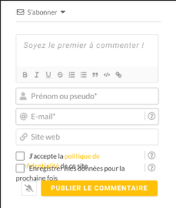
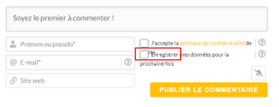
I have a layout issue on the mobile comment form after I added consent checkboxes:
Can you help me with this issue, please?
Thanks 🙂
Posted : 30/03/2023 5:15 pm
(@asti)
Posts: 8284
Illustrious Member Support
Translate
▼
English
Spanish
French
German
Italian
Portuguese
Russian
Chinese
Japanese
Korean
Arabic
Hindi
Dutch
Polish
Turkish
Vietnamese
Thai
Swedish
Danish
Finnish
Norwegian
Czech
Hungarian
Romanian
Greek
Hebrew
Indonesian
Malay
Ukrainian
Bulgarian
Croatian
Slovak
Slovenian
Serbian
Lithuanian
Latvian
Estonian
Show original
Translating...
Hi,
Use the CSS code below:
@media screen and (max-width: 600px){
   #wpdcom .wpd-field-agreement{
            margin-bottom: 25px;
     }
}
Put the code in the "Custom CSS code" textarea, located in the Dashboard > wpDiscuz > Settings > Styles & Colors admin page.
Don't forget to delete the caches before checking.
Also, please try in incognito
In case you want to say thank you! 🙂 We'd really appreciate if you leave a good review on the plugin page. This is the best way to say thank you to this project and the support team.
Posted : 01/04/2023 12:03 pm
(@nonobio)
Posts: 13
Eminent Member
Translate
▼
English
Spanish
French
German
Italian
Portuguese
Russian
Chinese
Japanese
Korean
Arabic
Hindi
Dutch
Polish
Turkish
Vietnamese
Thai
Swedish
Danish
Finnish
Norwegian
Czech
Hungarian
Romanian
Greek
Hebrew
Indonesian
Malay
Ukrainian
Bulgarian
Croatian
Slovak
Slovenian
Serbian
Lithuanian
Latvian
Estonian
Show original
Translating...
Hi,
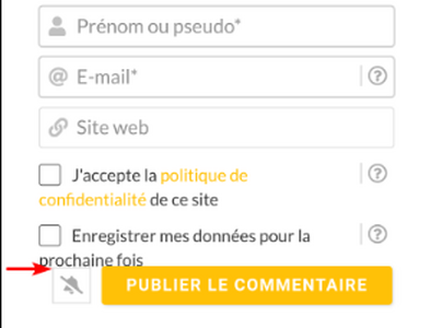
Thanks a lot, Asti, it is a lot better on mobile :).
Is adding a marge between the last line (cookies consent) and buttons possible? :
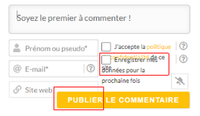
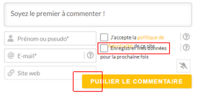
Also, I tested different window sizes on a desktop PC, and I have these issues:
Width between 601 and 767px:
Width between 768 and 990px:
Width between 991 and 1289px:
Is it possible to resolve these issues too?
Thanks
Posted : 03/04/2023 10:59 am
(@asti)
Posts: 8284
Illustrious Member Support
Translate
▼
English
Spanish
French
German
Italian
Portuguese
Russian
Chinese
Japanese
Korean
Arabic
Hindi
Dutch
Polish
Turkish
Vietnamese
Thai
Swedish
Danish
Finnish
Norwegian
Czech
Hungarian
Romanian
Greek
Hebrew
Indonesian
Malay
Ukrainian
Bulgarian
Croatian
Slovak
Slovenian
Serbian
Lithuanian
Latvian
Estonian
Show original
Translating...
@nonobio ,
Please watch this video: https://www.screencast.com/t/uOVa2Ib8O
The CSS codes below should solve all issues:
#wpdcom .wpd-form .wpd-avatar img {
    position: static;
}
@media screen and (max-width: 1040px) {
  #wpdcom .wpd-form-row .wpd-form-col-left{
     width: 100%
  }
  #wpdcom .wpd-form-row .wpd-form-col-right{
      width: 100%
   }
}
#wpdcom .wpdiscuz-item.wpd-field-radio, #wpdcom .wpdiscuz-item.wpd-field-checkbox {
    padding-bottom: 12px !important;
}
Don't forget to delete the caches before checking.
In case you want to say thank you! 🙂 We'd really appreciate if you leave a good review on the plugin page. This is the best way to say thank you to this project and the support team.
Posted : 03/04/2023 12:43 pm
(@nonobio)
Posts: 13
Eminent Member
Translate
▼
English
Spanish
French
German
Italian
Portuguese
Russian
Chinese
Japanese
Korean
Arabic
Hindi
Dutch
Polish
Turkish
Vietnamese
Thai
Swedish
Danish
Finnish
Norwegian
Czech
Hungarian
Romanian
Greek
Hebrew
Indonesian
Malay
Ukrainian
Bulgarian
Croatian
Slovak
Slovenian
Serbian
Lithuanian
Latvian
Estonian
Show original
Translating...
@Asti Thank you very much!!
All is working fine with this code and thanks a lot for the screencast, it helps me to learn how to diagnose similar issues :).
Have a nice day 😀
Posted : 03/04/2023 2:33 pm
Super Globals
Options and Features


