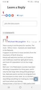
In finalizing the layout for mobile phones several hours have been spent in trying to fix a couple of styling issues (see attached screenshot). The issue is not present with desktops or tablets.
1) Connect With - this text disappears at 600 pixels width and below.
How can this text be restored for mobile phones?
2) Comment Author - how can the "Comment Author" be moved up and the "Comment Date" be made to wrap below the "Comment Author"?
This (mobile phone issue) can be seen in the comments section at the bottom of the following post on mobiles of 600 pixels and smaller:
https://focusingonwildlife.com/news/26-grizzlies-captured-18-euthanized-in-wyoming-last-year/
Hoping that someone will be able to point me in the right direction.
The CSS code below should solve the issue:
@media only screen and (min-device-width: 320px) and (max-device-width: 532px){
   #wpdcom .wpd-auth {
       margin: 0 !important;
   }
   #wpdcom.wpd-layout-2 .wpd-comment .wpd-comment-header .wpd-user-info {
      margin-left: 15%;
  }
}

#wpdcom.wpd-layout-2 .wpd-comment .wpd-comment-header {
    align-items: center;
}
Put the code in the Top Admin Bar > Customize > Additional CSS > "Additional CSS" textarea, save it, delete all caches and check again.
Please don't forget to press Ctrl+F5 (twice) on the frontend before checking.
Also, please try on incognito mode if you're checking on mobile devices. Because mobile browsers have a hard cache, you'll not be able to see the change immediately.
In case you want to say thank you! 🙂
We'd really appreciate if you leave a good review on the plugin page.
This is the best way to say thank you to this project and the support team.


