First off, thank you guys for getting Tenor GIF plugin out so soon. My users are loving it and the comment section is much more lively.
That being said, since you guys responded to that feature request in such a positive way, I thought I would give it a shot again, and post another feature request, me and the sites I've been working on have been requesting for a long time: paragraph comments.
Now, you must be wondering: "Wait? Doesn't wpDiscuz already have in-line comments? Why a feature request for something we already have?"
Well yes, and no. While they might be essentially the same thing, wpDiscuz's inline commenting is severely lacking when compared to paragraph comments on sites like Wattpad and Webnovel. Let me elaborate.
About paragraph comments:
In recent years web novels and web novel translations have gotten extremely popular. There are many web novel reading sites popping up everywhere, with the most popular ones like Wattpad and Webnovel.com having millions of monthly active users. And when it comes to reading this new format of novels, what readers enjoy the most is the paragraph commenting feature. Basically, on sites like Wattpad and Webnovel, every paragraph of text can be clicked on to leave a comment (and view comments left by other readers on that same paragraph). This way readers can react to what they read, ask questions, and discuss it with other readers - point out plot holes, ask if they don't understand what's happening, point out typos, etc.
I've been involved in this entire webnovel business for 5 years, and I can tell you with confidence that the sites that offer paragraph commenting feature get an entire order of magnitude more comments than those without (with the same amount of readers). The sites I mentioned (Webnovel and Wattpad) also offer normal comments that are left at the end of the article/chapter. But from my personal experience, every post has several times more paragraph comments than normal comments. And while the normal comments are something along the lines of "thank you for the chapter" the paragraph comments are totally different, full of GIF reactions and funny comebacks/jokes to what they are reading.
So now that I've somewhat explained the popularity and importance of paragraph comments, you must be thinking - ok, just add wpDiscuz's inline comment shortcode around every paragraph of text, and it's done, no?
Unfortunately no. Like I previously mentioned, the entire experience of wpDiscuz's inline comments is very lacking when compared to paragraph comments on a site such as Webnovel.com.
Paragraph commenting features on webnovel.com:
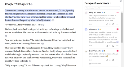
Upon clicking on a paragraph of text, users get an option to leave a comment:
Upon choosing to do so, or if the user clicks on the number of comments others left on that paragraph, a full-fledged comment view pops up from the side, or from below. The gif reactions, comment upvotes, and everything else is displayed properly:
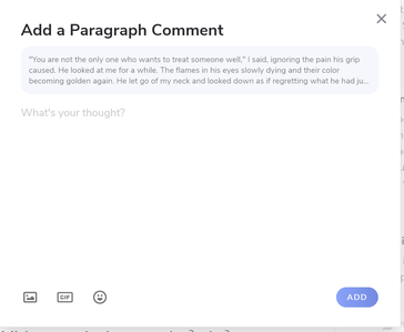
And if user wants to leave a comment, the full comment form pops up:
So how is wpDiscuz lacking?
Major issues:
1) The comment form that appears when the user tries to leave an inline comment lacks all the features of the full comment form:
There are no formating features or the ability to leave gif reactions. The latter is especially important! Users love, love, love leaving GIF reactions to the text!
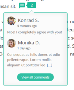
2) When clicking to view comments already left inline, the window that pops up is too minimalistic. It doesn't show proper formatting of comments like in the normal comment section. There are no links, pictures and upvotes, nor does it allow users to reply or upvote the comments or view replies to a comment! All of which are a very important interaction feature between readers that should absolutely be there!!
3) I'm not sure if this is correct, but I think that in the mentioned view, comments are shown by which are the most recent. It would be better if we also had the ability to sort them by those who have the highest number of upvotes. That way, once a reader clicks to see the inline comments, they can immediately see the best comments.
4) The comment text shown in this view is too short, basically just one line of text. It would be better if we could set how much text to show by default, because I'd like it to be several lines of text.
5) Clicking on the link to show the entire text of the comment is problematic because it doesn't load the text in place but scrolls all the way to the comments section on the bottom. See 7) for why this is problematic.
6) The number of comments that can be seen in this pop-up is very small. And there is no ability to scroll-to-load/load more either. And clicking on "view all comments" is very problematic because:
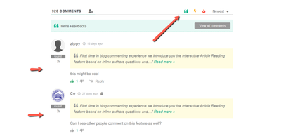
7) Upon clicking on "View all comments" wpDiscuz just scrolls the page to the inline comments section of the comments which show ALL inline comments, instead of just the inline comments of the paragraph the user is interested in! Besides showing all inline comments together, another big issue of this is that after user is done reading comments, he can't return to reading the article, because he is now at the end of it and there is no link to go back to where they left off reading!
Minor improvements after major issues are resolved:
1) An option to automatically wrap post paragraphs in inline commenting shortcode tags.
It would be nice to have a hook that will automatically wrap each paragraph of the article/chapter in inline commenting shortcode tag after saving it, if they aren't already wrapped with a tag.
2) It would be nice if clicking on the paragraph of text itself would bring up commenting interface/other comments on that paragraph, instead of having to click on wpDiscuzes green icon. Speaking of which, if every paragraph can be commented on, then the icon is redundant, and the space occupied by it could be better used to display comment number.
3) On Webnovel.com, paragraphs that contain comments left by the author themselves, display the comment number bubble differently to visually tell the readers that they can find the author's comment there.
4) If paragraph comments can be viewed from every paragraph, then it would be nice if the comments at the end of an article didn't include paragraph comments by default.
Hi @remiel,
Thank you for detailed description of issues. We keep improving the new Inline Comment feature. At the moment it's designed as a quick and light form to leave feedback on a certain part of the article in response to the article author question:
As you can see, this is an interactive article reading feature rather than a simple paragraph commenting. So this is correct to call "Inline Feedback", not paragraph commenting. Saying interactive article reading, I mean a dialog between the article author and reader. So the Author can ask a question on any part of his/her text and get feedback. This is the main unique point of wpDiscuz Inline Feedback feature.
And yes, the inline feedback is not a full-fledged comment section, so you should not expect all comment features there. We want to keep things as easy and light as possible. We don't want to move the whole heavy comment system in article content, that's why you see a simple comment form with a minimalistic short list of comments.
@tomson I know what it was meant for. But it doesn't work well even for that purpose.
Even if it is used to respond to the author question, social features such as replying, upvoting and ordering by upvotes should still work from the popup.
If an author asked a question, the first thing the readers would do is check if anyone else already said what they want to say. If someone already left a comment that they agree with, they would upvote the comment, if not, they would post their own.
In the current scenario, clicking on the responses would only show a couple of most recent ones without showing their upvotes nor allowing readers to upvote them. If the readers wished to view the remaining responses, they would be redirected to the comment section of the article, interrupting their reading experience.
If the article had more than one inline feedback section, readers wouldn't be able to discuss just that specific feedback section because in the comments area, all feedbacks are jumbled together. A reader might just be interested in responses to a specific question, but instead, he has to scroll through who knows how many responses to other questions.
After struggling to read the responses to the question that they are interested in, they might realize that no one left a response that they agree with. In which scenario, the reader would want to leave their own answer to the question. But here is the problem - they can't do that from the comment section. They have to manually scroll up to find that specific discussion section in the article (or, if they are really smart, realize that they can click on the "read more" button on a comment from someone who already left a response for that inline feedback to quickly scroll back up), and then click on it to leave their response.
Another usage scenario: reader clicks to see responses, sees a response that they really wish to comment on (perhaps to say "I disagree due to this and that"). But they can't. They have to "view all comments", and then find that specific comments among the sea of other comments to reply to it. By the time they do that, they might have already forgotten what they had wanted to say in the first place.
And lastly, as an author who is looking for reader feedback on my question, it is a nightmare, even for me to actually sift through the responses. I can't view all the responses for just that question. I can't open a pop-up next to the question and then thank the readers for leaving their feedback, I can't even show my appreciation by upvoting. And worst of all, I can't order the feedbacks for that specific questions by upvotes so I can't immediately see what the most of my readers agree with.
My point is, this shouldn't be all there is to the inline comments! They are a wonderful feature that should be further improved and I don't mind paying for that improvement in the form of an addon.
"We want to keep them lightweight" is a perfunctory response. For every problem there is a solution. And there are many minor edits that could be done that wouldn't increase the weight but would improve the entire experience a lot.
If an author asked a question, the first thing the readers would do is check if anyone else already said what they want to say. If someone already left a comment that they agree with, they would upvote the comment, if not, they would post their own.
The reader can do his/her first thing by clicking the button with number of feedback next to the comment icon and see what other people have already said.
As I've already mentioned in my last reply, the inline feedback is being improved, so the like/dislike feature could be added in future releases.
If the readers wished to view the remaining responses, they would be redirected to the comment section of the article, interrupting their reading experience.
Yes, I agree with this, we'll probably add a feature to see all comments in the inline comment list, so clicking the [view more comments] will load in the same pop-up window.
And lastly, as an author who is looking for reader feedback on my question, it is a nightmare, even for me to actually sift through the responses. I can't view all the responses for just that question. I can't open a pop-up next to the question and then thank the readers for leaving their feedback, I can't even show my appreciation by upvoting. And worst of all, I can't order the feedbacks for that specific questions by upvotes so I can't immediately see what the most of my readers agree with.
You as the author can do all these in the comment section. There is no reading interruption issue for you. Just go to filtered feedback section and see all feedbacks:
The button brings you to the filtered feedbacks in the comment section, so you can see all them in one place, you can like/dislike and do whatever you want.
If the article had more than one inline feedback section, readers wouldn't be able to discuss just that specific feedback section because in the comments area, all feedbacks are jumbled together.
Again, this is not a discussion board and this is not a comment system in the article content, this is a quick "feedback form" to get feedback from a reader. There is no discussion in the feedback area. This was designed as a quick feedback form in response to the author question, this is not a discussion section. If a reader want to do some discussion, he can click the bubble or the [read all comments] and go to the discussion section.
we'll probably add a feature to see all comments in the inline comment list, so clicking the [view more comments] will load in the same pop-up window.
Awesome!
the like/dislike feature could be added in future releases.
Great. I very much hope you add it.
You as the author can do all these in the comment section. There is no reading interruption issue for you. Just go to filtered feedback section and see all feedbacks:
As I already mentioned, I can view ALL the feedbacks but CAN'T view just feedbacks for a specific question. All feedbacks are mixed together.
Imagine having asked your readers 10 questions, and received 10 responses for each question. Now, as an author, you want to see the responses to the question "What article do you want me to write next?" and it would be great if the responses were ordered by the number of votes so you can immediately tell what your readers want you to write about the most.
However, instead, you go to the feedback section of the site and have to read through 100 comments to find those 10 which answer that specific question.
Now, if as an author, doing this is a nightmare, then what about for the readers? No one is going to read through 100 comments just to find responses to that one specific question.
Again, this is not a discussion board and this is not a comment system in the article content, this is a quick "feedback form" to get feedback from a reader.
Why should there be no discussion about the provided feedbacks? Getting reader feedback on other reader feedbacks can be just as important.
Imagine the above-mentioned scenario where the article author asked their readers "What would you like me to write about in my next article?"
One of the readers then responds "Write about best sight-seeing places to visit in Paris." and their comment gets a couple of upvotes. But then another reader responds to the comment saying "The author already mentioned a couple of places in Paris when they wrote about Must see places in France. That's why I'd rather they wrote about Irland next."
After that, the following readers that intended to like the suggestion about Paris would see the response to that comment and might change their mind thinking, "the second poster is right. Since there is already something about Paris on the site, I'd rather see the author write about some completely new place." thus they decided to upvote the second comment instead.
Thus, the author would get a much more valuable feedback from the question he had asked than if the feedback system was as rudimentary as it is right now.
Another scenario where feedback responses can be very important:
The author wrote an article and said "Hey, next week, I'll be visiting France. What place would you want me to visit and write about?"
One of the received feedbacks says "Paris"
One of the other readers then replies to this comment saying "+1, I want you to write about Eiffel tower and The Louvre in specific."
Another one then adds, "Notre Dame Cathedral for me"
In this way, the Paris-related feedbacks will end up grouped under the initial Paris comment, which will then give both the other people wishing to leave feedbacks and the author a much better "feedback"-ing experience.
If a reader want to do some discussion, he can click the bubble or the [read all comments] and go to the discussion section.
I already talked about all the issues with this. If you don't want to improve the feedback feature of wpDiscuz further or your team has different priorities you can just say so. No need for perfunctory responses that sound like you have not read anything I have previously written.
I am saying "Hey, I am a customer using your car, and I love the new seatbelt feature you've added. It's just that it is too tight and uncomfortable, it would be nice if you could change its material so it doesn't dig into the skin, and increase its length. Also, it is not sufficient to have seatbelts as your only safety feature. How about you consider adding airbags? (Insert a long explanation why airbags are needed.)"
And your response is "We designed our seatbelts for thin people. If you want to use them, consider losing weight. Also, seatbelts aren't designed to save you from a high-speed collision. If you think you are about to have a high-speed collision, use the brakes."
Um... yeah... thanks... ಠ_ಠ


